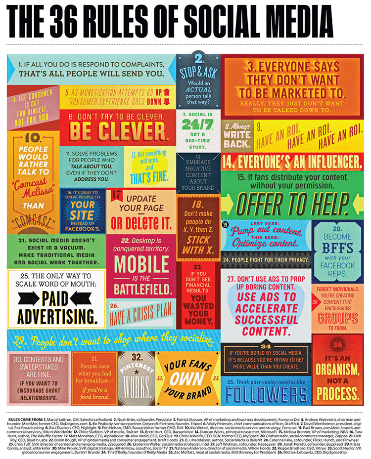
I was reminded about this particular Infographic today by a Facebook post from Kevin Ekmark. The Infographic itself is actually pretty old by Internet standards (over a year) but it is still very relevant. The smart folks over at Ultralinx really did a superb job collecting the information from reputable social media pundits and putting this together so skillfully!
I was originally drawn to this graphic because I love clever font work. This is especially true when an entire piece can stand on its typography alone. What I find most compelling is that each individual statement stands on its own and will likely continue to stand even as social media evolves. Collectively these messages come together to form a guideline of sorts. As a business, if we can remember and follow these simple rules, we are all but guaranteed better results from our efforts.
Are there any rules or standards that have helped you to be more successful with your social media efforts as a business? Please feel free to share them below in the comment section; we’d love to hear from you!
Click on the image to view full size.

