Formatting for your reader is one of the most important pieces of creating great content. The internet is consumed by so much noise which means that making sure your content is not only eye-catching, but also easy to find, will keep your readers coming back for more. In addition to writing great content, it must also be “skimmable.” This is essential to providing a positive user experience by satisfying your readers with how they read content.
Many readers are on a mission to find an answer to their question. If it’s buried in walls of unbroken text, they may give up and go elsewhere for the information. It should be a top priority for you to create easy to read content so that your competition isn’t the one your reader visits instead.
What Makes Online Content User Friendly?
In today’s post, we have put together a few ways to help create reader-friendly formatted content:
- Avoid large chunks of text.
- Break up sections with sub headers.
- Use bullet points to communicate information quickly.
- Provide a strong title and first paragraph to keep your readers on your site.
- Don’t forget to add visuals.
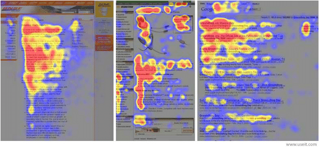
- Make sure the most important information is in the “F”- the top and left hand sections of the page. These are the areas where readers look the most, according to an eye-tracking study (see below) that used heat maps to represent the most-looked-at areas of the page.
Continue to check back for more from our content marketing checklist. Next up we help you navigate the world of images and visuals for your website and content. We will provide great resources that will make finding the right image and “free” images easier than ever!
Content Marketing Checklist
- Catchy headline
- Attention-grabbing introduction
- Useful information
- Reader-friendly format
- Choosing a visual
- Call to action
- Effective Closer

